Ben´s Bakery Responsive Website Experience

Community Shelter Responsive Website Final Design

The goal is to design a responsive website to help homeless people in my community have easy access to a consistent shelter and food supply in our community.
As the UX Designer responsible for the whole project from start to finish, I had to empathize with the users, understand the scope of the project, define the project. First, I had to create a site map to demonstrate an easy user’s flow, developed a high-fidelity wireframes, clickable prototypes, and user flow for the responsive website. The web and mobile version of the website is strategically designed in a way to enhance an easy user experience and also to increase Community Shelter users’ positive feedback and reviews.

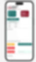
Mobile Web: Responsive Website Design
Problem: How easy is it for homeless individuals to be able to find their way around the Community Shelter website, and apply for shelter, and food on this website, and if the users are able to complete the user flow without a problem.
Process: To create a responsive website to help homeless individuals to easily find, and apply for shelter and food in our community without a long waiting time. To provide each homeless individual security, personal safety, and also to prevent hunger in the community, health problems and diseases.
DESIGN STYLE
Typography
LOGO: Permanent Marker 24Px
HEADER: Oswald/semi bold/24 Px
Sub header: Roboto/Bold/12Px
Body: Roboto /Regular/12 Px
Button: Roboto /Bold /14 Px
Colors

Paper Wireframe
The read marks on the different pages of the paper wireframes, highlight the various parts that makes up the final paper wireframe page.

Getting more relevant product information
I focused my design decisions around:
- How to visually prioritise the users needs
- How to design a responsive website that is easy to navigate through for both users and volunteers
- How to create a design that will increase more users engagement
Usability Studies,Findings and Solutions
Usability study findings:
After conducting a two set of usability studies, the first findings helped guide the design from wireframes to mockups. The second usability studies using the high-fidelity prototype, and the research study revealed that the mockups needed refining to enable a smooth user flow which is the main goal of the design.
Before Usability Study
The second usability studies report revealed that most of the users could not select other currencies apart from Krones to donate, because of that, this is now meeting the user ́s needs which is the bare minimum of what a good product should do.

After Usability Study
Before Usability Study
My goal is to create a delightful user experience, since users are the focus. So, when the usability studies revealed that most users had a problem making a donating in other currencies, I had to update it immediate to make the solution come true.

After Usability Study
My goal is to create a delightful user experience, since users are the focus. So, when the usability studies revealed that most users had a problem making a donating in other currencies, I had to update it immediate to make the solution come true.

High Fidelity Mockups: A user flow made easy

THANK YOU!
If you have a business proposal please contact me via email: Benyahminjohnsons@gmail.com